It’s day two of Lakmé Fashion Week when I get on a call with Aneeth Arora, the guardian of Péro. She’s just flown back to her HQ in Delhi and spent a whole day in alterations at her atelier after a hectic 24-hour stretch in Mumbai, where the show is scheduled on March 22. By the time this interview is published, Arora will probably be doing last-minute checks backstage, ensuring everything is in order before her Lakmé Fashion Week finale show. But she’s not stressed. “The excitement of seeing it all come together—that’s what keeps me going,” Arora says. “Every hour, more and more things keep getting resolved and the whole picture starts getting clearer.”
That sense of quiet, steady optimism is part of what has made Péro so beloved over the past 17 years. Since launching the label in 2009, Arora has built one of India’s earliest truly global ready-to-wear brands, one that has cultivated a devoted following from Tokyo to Delhi to New York and beyond. Her clothes are instantly recognisable: whimsical, tactile, and full of personality, with handcraft at their heart and an almost childlike sense of wonder stitched into every detail. In a fashion landscape that can often feel cynical or overly polished, Péro offers something rarer—joy.
Perhaps that’s why the brand inspires the kind of loyalty usually reserved for cult labels. For many who wear it, Péro is less about trends than about feeling: the comfort of a handloom fabric, the delight of unexpected embroidery, the quiet optimism that the NIFT graduate has infused into the label since day one. 17 years in, that spirit hasn’t dimmed; if anything, it’s what continues to draw people in.
Below, she tells us about her LFW schedule, what gets her in high spirits, and the surprise she has in store for all of us.
How was yesterday?
So, the day before yesterday, we left [Delhi] at 3 in the morning for Bombay. We reached, did casting till 2 o’clock. The fittings started at 3 pm. After that, I met the music band who’s gonna perform and the other people who are gonna work on the show. Then we went over all the 60 looks to see what needed alterations. We packed our bags at 12:30 in the night, got some sleep, and left for Delhi at 3 am. Then yesterday, we started and finished all the alterations, started working on the press kit and other elements. And today, the whole day we are just busy packing for Bombay.
Wow, what time do you fly out tonight?
It’s an early morning flight, so we’ll have to leave around 2 o’clock. We’ll reach there [Mumbai] by 7:30 and get to the venue by 10 o’clock, then call the musicians and start rehearsals. And then eventually, at 8 pm, we’ll call the models to do a full walkthrough with them because I’m taking all the accessories that we didn’t try in the fittings now. So, parallelly, we’ll be putting together each look for each model—with shoes, hair, everything—and editing the show.
That is so, so much work...
It’s not going to end there! Once we finish the rehearsals, we will get the actual show space by midnight and then we’ll start setting up, and we have some eight hours to finish the setup for the show. Because the next morning, at 9 o’clock, there is the rehearsal again in the main setup.
I was going to ask you what time you go to bed, but it sounds like you’re not going to bed at all…
Yesterday was a little better, because I was here in Delhi, so after I finished I think I was in bed by 11. And I’m an early riser, so I was back at work around 7.
Wow. How do you deal with so much travel and so much work in such a short span of time? Have you developed a caffeine addiction?
I’m not a coffee person, but I am always high on life and what is happening around me. The excitement just keeps me going, but the moment the show will be over I can’t afford to go off work completely. But I will just switch off for at least a day.
Although the theme for the show is Out of Office, like how people put in that OOO email and they are not engaging with anything. That out-of-office day will only be the Monday after the show for me and then Tuesday onwards we will be back. It’s like how kids are always so excited about anything they’re doing, and parents always keep them excited by saying we’re going there on Sunday. Every next thing excites me.
This time, the show is in partnership with Lakmé’s 9to5 Hya Beach edit. Are you a beach person or a mountain person?
I am a mountain person! But I am going to the beach after the show.
I actually thought this was going to be a workwear collection, but you’ve just told me it’s more of an out-of-office collection.
It is. But actually, the theme plays like this: we show work. It’s not really literally workwear but office wear because we started with pinstripes. And because there is this beach connect to it through Lakmé—and if you see their products, it’s their 9to5 range, which is about how makeup can last from 9 to 5, and then maybe 5 to 9 again after office.
Even before Lakmé approached us, because we were doing so many different kinds of stripes and the colour palette was blue and white, we thought about how we could offer alternative ways of dressing at the office. And somehow, it all connected. You know that pleasure and joy that we get when we put an out-of-office email [auto-reply]—that I’m going on a vacation, so I won’t be available.
But through the show, we will be representing how the day starts in office with a lot of frenzy and rush. And then towards the afternoon, monotony sets in and people are yawning and getting bored. But towards the end, they are all excited because the day is over. In this case, they’re excited because they’re applying for a vacation. Eventually, the whole mood will translate into a happy, vacation mood.
I was talking to your collaborator Nikhil D yesterday and he said it’s a little different from the usual Péro fare. How so?
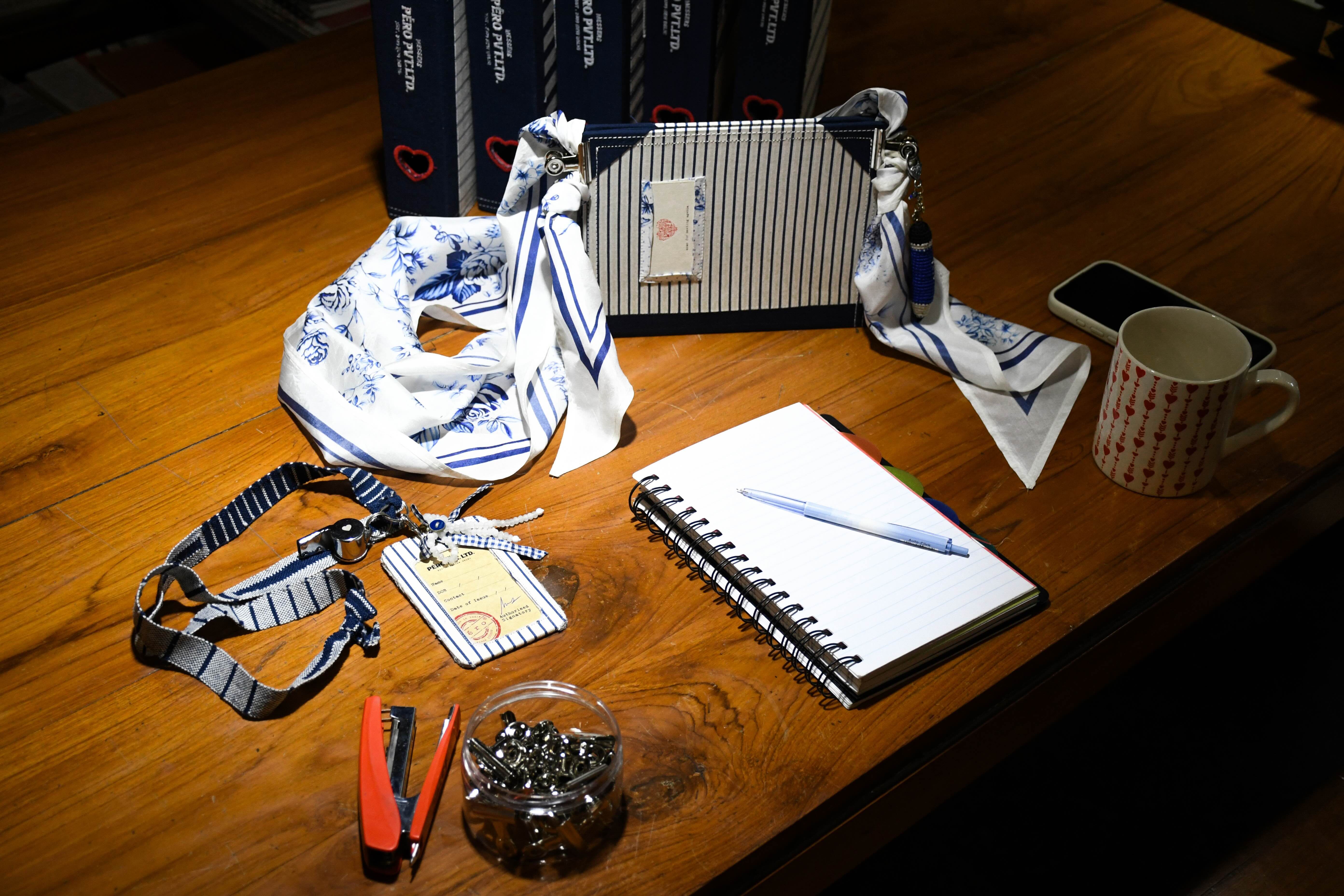
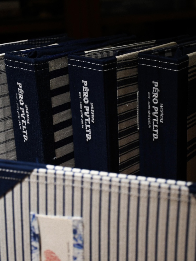
You might [be familiar with] a word called restraint. This time, we have practised restraint in terms of the colours we are using because in all our previous seasons, colour is really over the top. This season, we just decided to use blue and white, so one element of surprise for people is that we worked in only two colours. We don’t even have shades of blue. But in terms of presentation, we like to surprise people every season with a new setup. So, I think there is newness in these two ways.
Did you find it limiting to work with just two colours?
No, not at all. In fact, it was even easier. You know how when you go to office and every morning you have to think about what to wear. In this case, when we were putting together these 60 looks, everything went with each other beautifully and seamlessly. It was such a fun exercise because we could mix florals with stripes and checks and it still didn’t look over the top. We usually don’t follow any rules with the way we mix textiles in our looks, but here it was so seamless that anything that we put together just made a lot of sense.
Why did you pick white and blue and not yellow or pink? Were you inspired by a specific artwork or Greece, for example?
The reason we chose blue and white is because I saw somebody wear Riviera stripes on a vacation. And then, a few days later, I saw someone else wearing similar stripes to the office. I was really, really inspired by the fact that something so classic and simple can travel from a vacation to office. And I really liked that idea of playing with the colour blue because it’s something we see all the time on umbrellas, on couches, on the beachside when people are on vacation. But we also see a lot of it in the office. So, I thought this could be the perfect [way to start the collection] because very often we start the season with colour.
You’ve answered some of this already—but what was on your mood board?
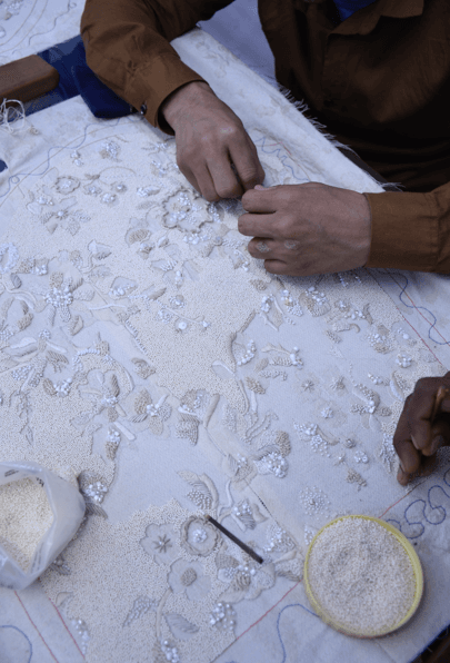
While we were researching, we came across a lot of things that are blue and white in terms of art and craft, not just in India but also overseas. For example, blue pottery: Chinese porcelain, Delft pottery. Things like cyanotype, French toile de Jouy. It’s about narratives, but we did our own take on it. We’ve done florals that from a distance look like toile de Jouy but when you come closer it’s all florals. Anything blue and white became a part of the mood board—these layers started coming in and started giving us direction on surface embellishments and the prints. The mood board was very, very enriching.